This text is taken from the paper "Del Ambiente y su Ornamento" read on April 26, 1991 as part of the series of lectures held on the occasion of the creation of an Environmental Design section within the Plastic Artists Association of the Cuban Union of Writers and Artists (UNEAC).
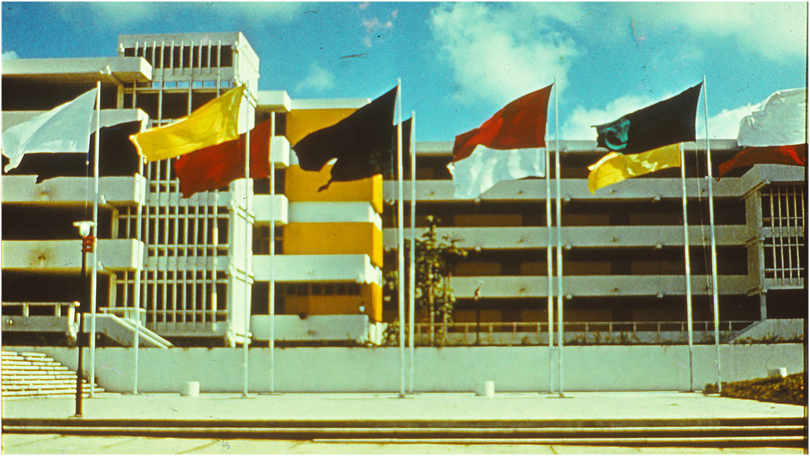
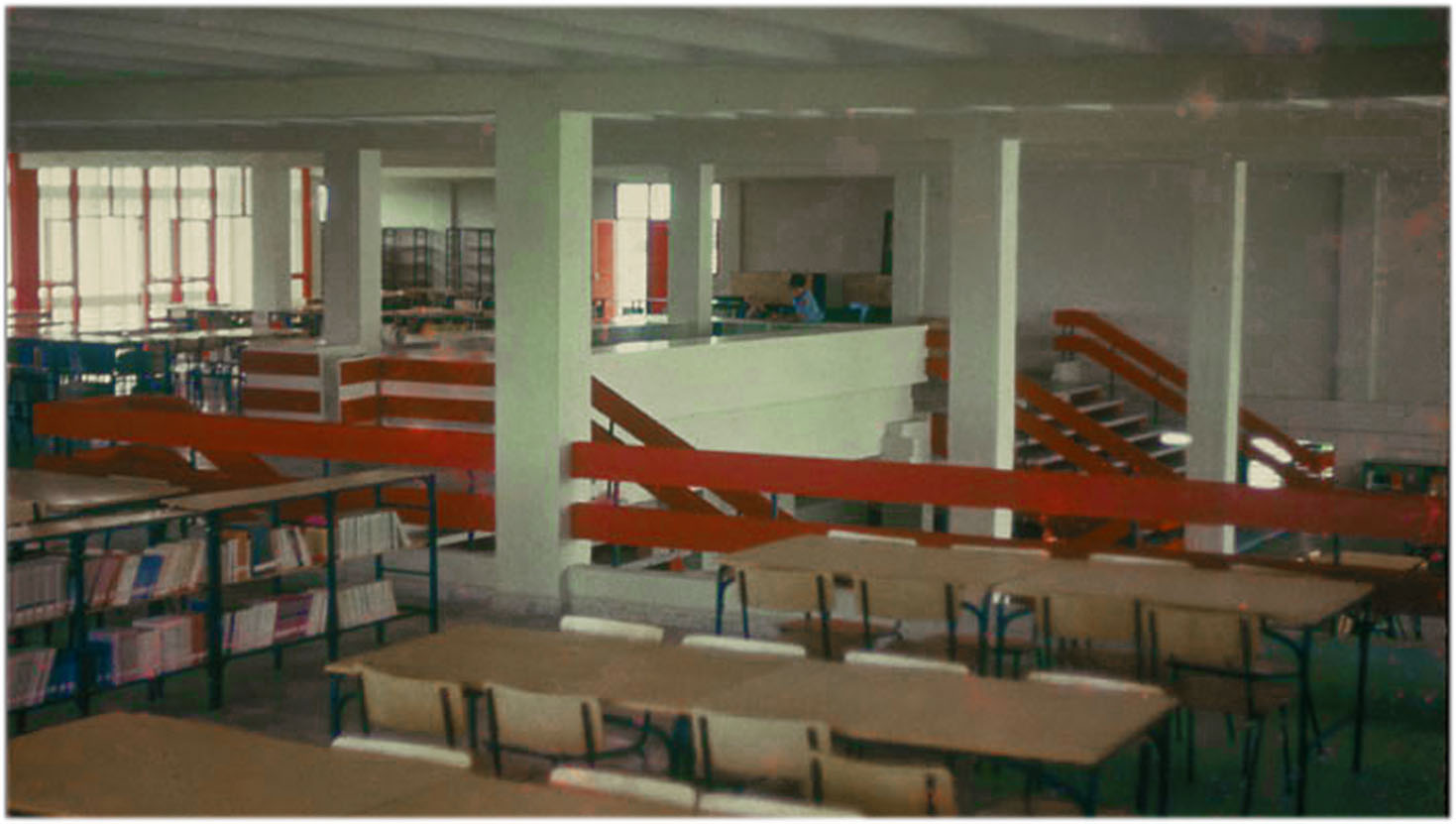
Unlike furniture and almost all of the designed objects, Architecture is characterized by its absolute visibility. Furthermore, Architecture usually provides the framework within which other objects will be perceived, mediating in its sensorial appropriation. Architecture is, for all this, inevitably communicative. Hence the need to consider, beyond what is strictly functional, the series of contents of which architecture shall be an expression. In these schools much is given to us beforehand. First, the prefabricated building system. This set of components and the way assemble them(21) was developed specifically for the rural school buildings plan. Its design only takes into account strictly technical parameters. We don't believe any symbolic intention prevailed in its authors. But sometimes the most eloquent symbols await crouched in the collective unconscious. This is the case with the 'Girón system' and certainly part of its undeniable merit regarding an adequate characterization of these buildings. Indeed, the schools building plan of the seventies is nothing but a disproportionate effort in building Utopia. The means and the ends are very much alike those postulated by people like Owen and Fourier: the creation of a new man through life and work in community. However UTOPIA etymologically considered means non-place, a place that is not. An architecture of utopia's relationship with its locus shall be very special. Schools that do not occupy a place, buildings which levitate, raised above the slight imprint of their pedestals, barely touching the ground. The architecture of u-topos is an architecture without toponymy and without topography . An architecture without toponymy is an essentially ubiquitous architecture: multiple object par excellence. Without topography that is discounted as a negative cipher from a 0.0 structural level, ideal plane to which one ascends by stairs simply supported, without continuity with a structure they barely tarnish, a transient concession to the contingency of its terrestrial anchorage. An architecture that will seek its fulfillment as a topology in which the program for a minutely regimented life is embodied. 'The peculiar feature of the language of art' -according to Lévi-Strauss- 'is that there exists a profound homology between the structure of the signified and the structure of the signifier'(22). This is especially evident in projects such as those carried out for the school building plan. In our project for the Maximo Gomez Vocational School(23) we had to take into account the full range of conflicting requirements that come into play from the complexity inherent in a program of such magnitude. Including a series of common use facilities for the totality of its 2,500 students, the school should however provide conditions for the relatively independent operation of two different school levels, high school and senior high school. The school would be located in the city, but without being a part of it; its students were to be linked to both agricultural and industrial work. The institutional regulations called for collective activity while individual personality has always required moments of intimacy. The training received at school would be comprehensive, but its purpose was to promote the students' interest in science and technology. The building system and functional solutions had to be those mandatory for the national school building plan, but the representative character of this one school as a symbol of the province's achievements and aspirations demanded a physiognomy of its own. All this found expression in the particular arrangement of the buildings and the range of meanings implicit in its architecture. The project was organized around a central axis which grouped the common use facilities and two sectors on either side of this axis that would correspond to the two school levels. The bilateral symmetry is only approximate since it must accommodate to a number of factors, among them the construction sequence which provided for the phased implementation of the project, the need to include the cooking and dining facilities in the first stage, the presence of an outdoor amphitheater which was also intended for activities of the neighboring city but that should not interfere with teaching activities and finally, the difference in the number of students, higher in high school than in senior high school. In addition we felt that from a formal point of view an overly strict symmetry would reinforce the duality of the layout at the expense of its unitary perception. This unity is evident, from the inside, in the articulation of squares and other areas between buildings which assume diverse functions depending on the characteristics of their surroundings. From the outside this unitary character is strengthened by emphasizing the central core through the concentration of built volumes, the greater complexity of its geometry and its careful characterization. The focus on science expresses itself in the location in the prominent position within this core of those facilities to them dedicated: the laboratories, the computer center, the library and the museum, built using the same prefab system but with an idiosyncrasy of its own incorporating certain constructive elements designed specifically for this project. Among them special attention is deserved by the guardrail panel system that characterizes the grid in which the buildings are inserted and establishes an autonomous plane of interconnection not dependent on the site's topography. The central core includes the school's main entrance. It not located facing the access road, instead it is oriented sideways, conforming a ceremonial space which culminates in the equestrian statue of the Generalissimo by the sculptor Delarra. This space is a square and at the same time an entrance, reinforcing with this ambivalence, inner space / outer space, the sense of a relatively closed autonomous community The use of color deserves a special mention. Used as an accent, it helps in prioritizing the central axis stressing in particular the laboratories with big chrome yellow wall sections. In the standard dormitories color is used to solve the contradiction between the openness and relief of the longitudinal façades with their continuous windows and cantilevered balconies, and the poverty of the buildings' extremes, totally flat and closed. The red and violet on the balconies -protruding both as perceptual code and physical reality- are continued on the building extremes' facings, as do the blue and green from the windows -back physically and as perceptual code- giving rise to a dual reading -physical plane vs. coloristic code- in which the suggestion of relief prevails. In addition to the work of the sculptor Delarra at the entrance of the school there was a beautiful sketch by painter Raul Martinez meant for a mural at the library that never came to fruition. This school marked for us the beginning of a collaboration with visual artists which is characteristic our most recent work.
|  Sistema Girón. Dibujo de R. Fornés. Sistema Girón. Dibujo de R. Fornés. La Escuela y la ciudad. La Escuela y la ciudad.        Foto: Roberto Segre Foto: Roberto Segre     |


